Friday, 8 October 2010
Wall space shots and initial ideas for PSS interiors brief.
Produce wall design for the toilet in Paper Scissors stone's salon : Rebel Pinup. I was given a few buzzwords to get me started, they were: Pinup, tattoo, boudoir. I went round the shop yesterday and took some photographs of the space and the surrounding area in the shop. Because I have been asked to bring this space in line with the rest of the shop, I think its useful to visually follow suit with the colour scheme and the visual approach that is already there. I'm taking inspiration from the items in the salon already, like the heavily ornate mirrors and black and gold period furniture.
So the Approach Im thinking about at the moment is Sharp floral and flourish vectorised illustrations with a tattoo style approach. Visuals include: Skulls, roses, flourishes, brocade, animal skin rugs, knuckle dusters, vines, fruit e.g pommegranites and scrolls. An obvious colour scheme is in my head at the moment. Being, Black, white, gold and then a lustre maroon (the wall space in the salon is maroon.) using maybe a few shades of the last colour. So my colour limitation will be: 3 colours + stock (being white)
Heres the wall space I will be utilising:
These are the walls, theres quite alot of space to work with, and I think theyre ok with me using the ceiling and floor within my design if need be. All the stuff on the walls will obviously be removed when it comes to be applying my illustration to the wall. But that in itsself is a problem.
How do I apply my illustration to the walls?
I have been looking at a few bits which I will explore in greater depth in another post.
- Painting directly onto the wall
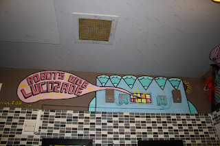
As long as I made sure the illustration was accurate and well composed, this could be a real option. Here is the illustration in the toilets and down the outside wall of the nation of shopkeepers pub in Leeds. Hand painted stuff looks engaging and adds life to its surroundings. I Think this would be a successful way to solve this problem, but I would need to practise alot, because I havent done any vertical painting with a brush in a long time, and the difference between horizontal painting and vertical painting is quite great.
- Spray paint?
Realistically, I'm not going to spray paint on the wall. But how nice is this promotional artwork for a vintage/ record shop!? I think it was actually done using stencils to build up tonal values and then airbrushing was added in afterwards. It looks great though.
- wallpaper/ Vinyl stickers directly onto the wall
This is definately an option because it would mean I could produce really detailed digital illustration and then just stick it up directly onto the wall. I think still with this technique, accuracy is very important so alot of thought would still need to go into the actual application of the design onto the wall If i picked this approach.
For now I think my plan of action will be,
- develop visuals
- keep informing myself with reasearch into key areas of visuals and techniques
- work digitally and by hand for now up until I meet with steve again.
Cheers.
J
Subscribe to:
Post Comments (Atom)


No comments:
Post a Comment