Sunday 24 October 2010

Book Design - "Wabi Sabi"


This is one of my favourite books at the moment - "Wabi Sabi is the quintessential japanese aesthetic. It is beauty of things imperfect, impermanent and incompete. It is a beauty of things modest and humble. It is a beauty of things unconventional". Its got good content, but what makes this book for me is the stocks its on, the fact that it is all printed in greyscale except for the cover,  and the actual book design of the columns and paragraphs is really easy and comfortable to read. I like the full bleed Image idea which is used throughout the book too.  This is something I have been looking at and was helping me to make decisions about stock and printing process whilst having to deal with a budget. The book shows for me that you dont have to spend big bucks on something to realise it to a point of perfection - as long as the content and function leads a book, the look of it will follow and be totally apropriate to what the book actually is.

Existing design for the college


This is the first yearbook of the BA(Hons) Graphic Design course. Because I have articles and images that have to be presented in an engaging and appealing way, I thought I'd look at what has come off the same course as me, and has been for the LCA institution. On pages with imagery the type is pretty minimal, and is tight in a column at the side of the page. The stocks that were used for this book were really nice too. I dont know if choosing a stock would be an option for me as it would have been supplied.


This year's course prospectus. Immidiately, I was drawn to the foil on the cover (not an option for me in this instance) and the way that the type overlays images. The type is big and easily legible - Looks like it could have been Century Gothic Bold, which works really well  here. The type inside is set on in strict colums with bold headings, with the heading type at the same size as the copy. From looking at this publication, I think the stricter and more complex I make a grid, the more information I will be able to fit on a page in an appealing way,making it check out visually with the rest of the page.


Yearbook Number 2 from BAGD. There are some really interesting uses of type and layout in this book, and I like the way that the images arent always sitting on white space, in the lst image you can see this happening, with reverse out type cutting through the solid black. Reverse out is something I have been playing with and I think it works well to help command a message and cut through dark colours or dark images.


This is last years prospectus, the pages with alot of copy in them split up visually with two colours and the cover was embossed (really nice type on the front)  which is something I would love to do on my newsletter but somehow I'm pretty certain that the budget for a newsletter wouldnt really allow for that. These four publications give me a clear idea about how other designers have dealt with the same problem that I am, but in a much bigger way. I think it was good to look at this to see what sort of standard of quality I should be aiming to achieve.

Saturday 23 October 2010

Amazing Mcbess


Morning breath - Colourways


I think most illustrators get a bit jealous of the images that come out of morning breath. I know I do! I love the way they use colour and tone. The Queens of the stone age poster is Two colour plus tints, and it just shows how much can be done with black through to white before other colour even comes into it. Youve got, mid tone, highlight, dark areas and outlines, then the pink just adds to the overall impact of the image.

This would be a good way for me to think about my images tonally, If I do want to have the book in black and white, tone is going to be a really important part of my imagery to add depth. If I was going to work in colour, I think I would go about it in a similar way to this, usig overprints and a very choice colour pallette.

Reuben Rude


Reuben rude is one of my favourite artists at the moment, not for any conceptual reasons, just simply because of how he puts lines down on a given surface. His eye for it seems quite similar to mine, only difference being, this guy is absolutely shit hot at it. He works the same way in painting as I try to work digitally. The way he makes a character look using thick lines that run off into a sharp point is really effective, and then he further enhances this using alot of colours for fills or an overprint feel. In time, if I ever get the time to do a painting, I would love to explore the technique thats done here. I mean, it can be done in other ways, Morning breath are almost a digital equivalent only with more typographic insight.

Caspar Williamson, submission for Nobrow.

This was Caspars submission to Nobrow magazine. This is two colours not including stock and is made up of quite thick textural line work to make tones and shades on top. In print, it almost looks like a hand coloured photocopy because of the level of detail in it. What I like most about this image is the actual form he has chosen to give the jellyfish, with long tapering tentacles (Or cilia, as I have found out throughout gathering the copy for my book.)

Caspar Williamson / Glow pigment overprint.


Caspar Williamson is an illustrator/designer/printer. The work above is actually by Franz Vesolt, but as far as I can tell was printed by Caspar Williamson. Its a great idea, simply dat and night. in daytime you see the first image, and at night you see the glow in the dark overprint. Im really glad I found this because it shows how good getting some glow in the dark ink could be. Ive sent the check off for the stuff today, so I should have it half way through next week.

The line work here also works really well with the glow overprint, its simple and suits being illuminated because of its content. This is something I am hoping pulls off well with my use for the glow in the dark. The idea is that I'm going to print my squid icon I developed at the start of the project over the front cover.

Jens Harder


Jens Harder is an illustrator and a comic book artist From germany. I found her in NoBrow magazine issue 1. Jens doesnt just draw sea life, but here are two particulary good examples of how Jens uses line and how it translates across to sea life imagery. Jens uses lines to create tone, and in the image above Jens has also used one colour to help build up a tonal quality to the squids bodies.

In most of the imagery I have seen of Jens she uses 3 colours including her outline colour, which is something I have been doing for my sea life illustrations, I think something I can take away from looking at Jens work is that the more detail you put into the line work, the richer the image you are working on will become, making it much more appealing to only add  a few simple colours the emphasise the immidiacy of the image.

I find the way Jens produces line work really appealing and it has the qualities of a really well done pencil drawing, so as is stands I'm pretty unsure how she does these illustrations, I mean they could be digitally done but they have an organic look to them too so she could be really good at pencil drawing and inking, which is probably closer to the truth as she is also a comic book artist.

Friday 22 October 2010

After my tutorial with Mr Bingo.


Mr. Bingo is a cool guy, and hes really got his head screwed on. I really appreciated talking to him about the way he goes about working as an illustrator and I feel more confident about submitting work and getting my work out there now. Initially I had a few questions for him:

How did you get recognition when you were starting out?
He said that having a website is really useful nowadays and that I am doing the right thing to submit illustrations to submission based Zines because potentially if somebody who was involved in editorial saw my work, they would probably hire me for a job - which really suprised me! But I apreciated the comment because it has made me feel more confident hearing that form someone who isnt a best mate.

Did you initially struggle with finding a context to fit your work within?
He said that basically, everything he does is for money so there is normally a context already there. I think tht personal work which dosnt have a context is fine, but a context will make an illustrator basically look more employable. Bingo also said that Humour as the primary focus of his work and always has been.

We also talked a bit about some work I was doing and over all it was a really constructive and positive feedback process which I was really happy about. For my book, Bingo said I could consider:

Stock colour & cover to make the initial visual contact with the book more striking and immidiate to someone who might buy it. The cover at the moment is a bit of a let down in regards to the rest of the book, which i totally agree with and I think I should change it before I print it next week.

Overall a really good day, and a really good visiting professional!

Visiting professional : Mr. Bingo

"Some say he's the 'Master of pens'.
Some call him the 'Shoreditch Beat Busketeer'.
Some say he fucks about for a living."

Mr Bingo has come in today, who is an illustrator, Who does alot of work for editorial.

The image above is something ive seen a few times in books and on the internet. But I think his visual style has alot of appeal and I also think in some ways its quite similar to the way I draw so the tutorial I'm having with him later on in the say should be really helpful and interesting to see how he deals with illustration issues.


As far as I can tell what Bingo does is vector artworks, but I spose I'll find out later today when I talk to him anyway. I'll put more stuff up about him after I have had my tutorial with him.

Friday 8 October 2010

Census of marine life website

Just been on the Census of marine lifes website, its interesting to see how they are dealing with images and type to give readers entry level information about deep sea life.

Ill upload the images tomorow, the server is rejecting them

The release of marine census 2010

As Fred so rightly pointed out on wednesday;

I was missing a trick on my fish publication! The release of the 2010 marine census has now happened with catalogues over 5000 new species of fish and is being heralded the age of discovery. I think I need to now be thinkning about the way my publication fits in with this one. At the moment Im thinking I want to promote the marine census book, the cover is here:


I'm going to do my best to get hold of a copy of this. I think it might well be in waterstones or something like that, but if not Ill have to order it online. Either way it will be a great thing to get my hands on to help inform what I'm doing. I also want to mention that I dont think I'm producing any stuff as part of a range now, other than posters and stickers just to do justice to my illustration.

Wall space shots and initial ideas for PSS interiors brief.


Produce wall design for the toilet in Paper Scissors stone's salon : Rebel Pinup. I was given a few buzzwords to get me started, they were: Pinup, tattoo, boudoir. I went round the shop yesterday and took some photographs of the space and the surrounding area in the shop. Because I have been asked to bring this space in line with the rest of the shop, I think its useful to visually follow suit with the colour scheme and the visual approach that is already there. I'm taking inspiration from the items in the salon already, like the heavily ornate mirrors and black and gold period furniture.


So the Approach Im thinking about at the moment is Sharp floral and flourish vectorised illustrations with a tattoo style approach. Visuals include: Skulls, roses, flourishes, brocade, animal skin rugs, knuckle dusters, vines, fruit e.g pommegranites and scrolls. An obvious colour scheme is in my head at the moment. Being, Black, white, gold and then a lustre maroon (the wall space in the salon is maroon.) using maybe a few shades of the last colour. So my colour limitation will be: 3 colours + stock (being white)

Heres the wall space I will be utilising:


These are the walls, theres quite alot of space to work with, and I think theyre ok with me using the ceiling and floor within my design if need be. All the stuff on the walls will obviously be removed when it comes to be applying my illustration to the wall. But that in itsself is a problem.

How do I apply my illustration to the walls?

I have been looking at a few bits which I will explore in greater depth in another post.


- Painting directly onto the wall

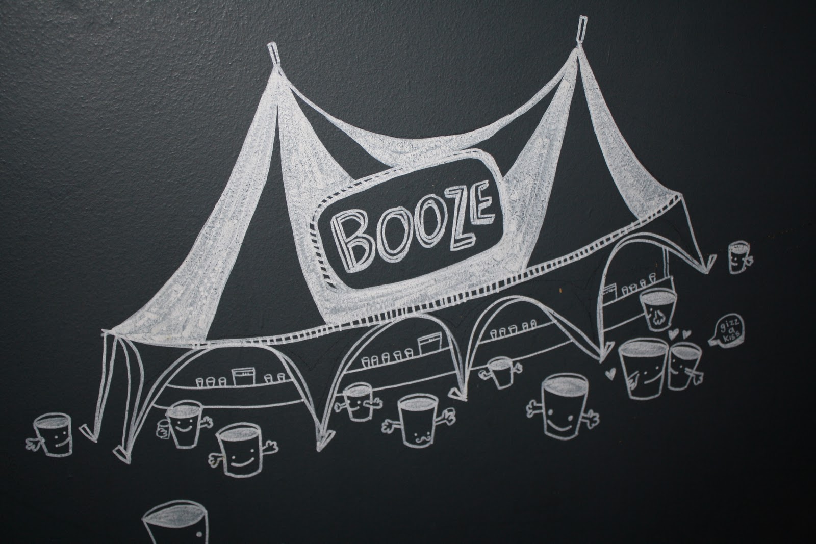
As long as I made sure the illustration was accurate and well composed, this could be a real option. Here is the illustration in the toilets and down the outside wall of the nation of shopkeepers pub in Leeds. Hand painted stuff looks engaging and adds life to its surroundings. I Think this would be a successful way to solve this problem, but I would need to practise alot, because I havent done any vertical painting with a brush in a long time, and the difference between horizontal painting and vertical painting is quite great.

- Spray paint?

Realistically, I'm not going to spray paint on the wall. But how nice is this promotional artwork for a vintage/ record shop!? I think it was actually done using stencils to build up tonal values and then airbrushing was added in afterwards. It looks great though.


- wallpaper/ Vinyl stickers directly onto the wall
This is definately an option because it would mean I could produce really detailed digital illustration and then just stick it up directly onto the wall. I think still with this technique, accuracy is very important so alot of thought would still need to go into the actual application of the design onto the wall If i picked this approach.

For now I think my plan of action will be,

- develop visuals
- keep informing myself with reasearch into key areas of visuals and techniques
- work digitally and by hand for now up until I meet with steve again.

Cheers.

J