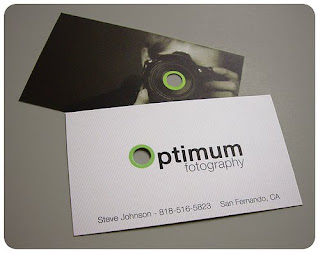
Found these di cut business cards on the tinterweb, I would like to produce something with a cut out which compliments my logo because I think the form of the logo will work well using negative space and cut out in a business card format - it will set the card apart from others that bit more. The optimum photography is a really nice touch because the whole idea is the cutout means you are seeing through a lense - this would be a good idea to incorporate into my cards - for example let the viewer see through the eyes of a roots music record label.
Subscribe to:
Post Comments (Atom)


No comments:
Post a Comment