Friday, 8 October 2010
Background research into 18th century biology catalogues
I visited an antique book dealer in York yesterday. I dont think he was particularly happy about it, but he allowed me to take some pictures of his 18th century biology and botany books. Above are some Lithographs of human biology illustration. They are really detailed, because back then it was the only means of recording this kind of information. Now with the advent of technology these books arent so neccessary, but their accuracy is still great in terms of detail and the page layout is something I can still consider for the publication I am currently producing.
I got alot of insight into how to layout a page in this mannor because of the amount of different books about different species of animal that were available to look at.
Some hand coloures copper plate etchings here. It took me back to my previous course where alot of my work was driven by this print process and made me think it would be great to produce an etched image for my publication. The line work is very fine, and the approach I am taking because of different research sources I have been informed by, obviously my ilustration is going to look different, but personally I dont think you can beat the classic 18th century illustration.
I found these pages which are all from the same book, which catalogues insects. The catalogging is absolutely comprehensive, and would have obviously been a very useful, functional tool for bugspotters of the 18thC.
This set me off thinking about extra pages I could add to my book such as a page, with every illustration on it, with the animals split into their different species families and their seperate Genus's layed out in almost a Darwinesque/ infographic hybrid tree of life. This research has definately blown the content of this book wide open again, which is great because it all goes towards making the book far more substantial.
Tuesday, 5 October 2010
A look into type...
The sans serif typefaces look alot better and one in particular stands out for me. This being Baskerville old face. The type family looks really interesting and the italic version of baskerville oldface is really nice looking. I think its character is classy, but functional and vintage. Which is a nice look for my publication.
Baskerville Old face it is.
An idea for the visual approach to my publication I'm on with.
From Darwins book on the Theory of evolution. Some good old classic victorian labelled anatomy and botony. Looks great and I think It is really applicable to the work I am doing, would tie type and image together in a functional way really nicely for my publication. I'm going to have a go at producing something similar today.
Inspiration -
- Serif type
- Labeled images
- minimal type
- Emphasis on layout and page composition.
- Later on also, I will have to consider paper and stocks for a really nice visual effect that makes it clear what the publication is all about.
An article from todays metro - tuesday 5th October
Found that article this morning on the bus into town. this topic seems to be on the lips of the media at the moment, and as the article says; There has been a global investment of £410 million into deep sea studies.
The article also has some facts and figures in it which will most likely come in handy for the content of my publication. A selection of this information would probably help shape a testimonial at the beginning of the publication.
Plus its given me a new idea for an illustration - the hydrothermal vent snail.
Im going to have a dig for some better imagery, but theres a taster. This makes my tally of fish to include 23 and counting, it would be nice to get this number up to about 30, but that all depends on how much time I want to allow myself to do these illustrations. Which, isnt actually that long ( about a week so I can get on with researching content and start the type layouts in consideration for print ).
Monday, 4 October 2010
A look into specialist laquer prices...
Ben, This one's for you. Me and Ben went to the print studio this morning to find out about some specialist inks we could order to use for the upcoming print job at the end of our first brief (Manchester Book Fair.)
We had both decided that we wanted to use a specialist ink because the specific inks we want to use have relevance to our subject matters.
Mine being glow in the dark ink - I want to use this for two reasons.
1- Deep sea fish are often bioluminescant, a great way to communicate this through high end print is using glow ink.
2- I'm a show off.
So, Ill be ringing Quality colours London tomorow! Aparantly a contact Gareth Gave me will supply to students and also do me a deal on a smaller amount of ink than he normally stocks. AWESOME!
Use of colour and line weight in digital illustration
Some great visual referance. I actually own this T- shirt and its an awesome example of crisp digital illustration translated into colour separated screen printing. The design is from the Disturbia clothing website. (which is great for nasty illustration on tees.)
This image and others in the same visual approach are making me think about how I can use line weight and colourways/tints to achieve a very high impact and high detail look, which will translate well into print - possibly high end print for publication at that.
This shirt is 4 colours not including stock, and uses a multitude of line weights. I know that the illustrations featured on disturbia are all digital because I have a shirt and a postcard with the same image on, both at the same image quality, making it pretty obvious the images are vector lead. Which is perfect, because I've just bought a wacom tablet - Anyone would think I planned it.
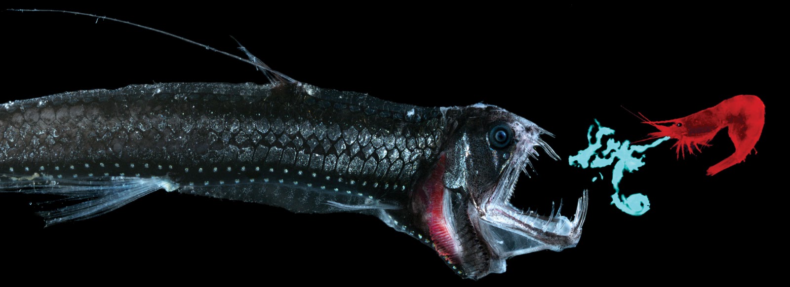
Deep sea fish publication - visual content source material
These are deep sea fish. They make my skin crawl. So what better subject to produce a series of illustrations about? Some very weird and wonderful creatures here ranging from the vampire squid to the blob fish. Obviously these images are the start of me using referance imagery to base my illustration on for the content of my publication. I think something I blatantly need to think about is what limitations am I setting for colour here? I deliberately left this area of the brief quite open so I could make a more informed decsion later on based on my content and visual approach at the end of the brief just before printing.
I was talking about my project with Ollie earlier, and he came up with this idea:
"If the book is a classification archive, why not base your type and layout solutions on old victorian botany books and the like." - obviously im paraphrasing here, but you get the idea, and I think its a pretty good idea. So this visual approach needs exploring. I'm thinking serif fonts, flourishes - and possibly greyscale. I want to think about colour after I have all the content finished first because the publication is definately visual and content driven and these are the most important factors right now, everything else is secondary.
Subscribe to:
Posts (Atom)