This image I found is probably the best way to some up the values of the record label I am designing for.
Basically a love for music with soul.
Monday, 17 May 2010
Digital sleeves on iTunes
Two of my favourite albums, the album art is incredibly simple, granted the type looks small here, but full screen the type is legible. But I like these two albums because of the minimal use of type and the one colour, simple image.
Wednesday, 12 May 2010
CD packaging design: relating the cd packaging to the record sleeves.
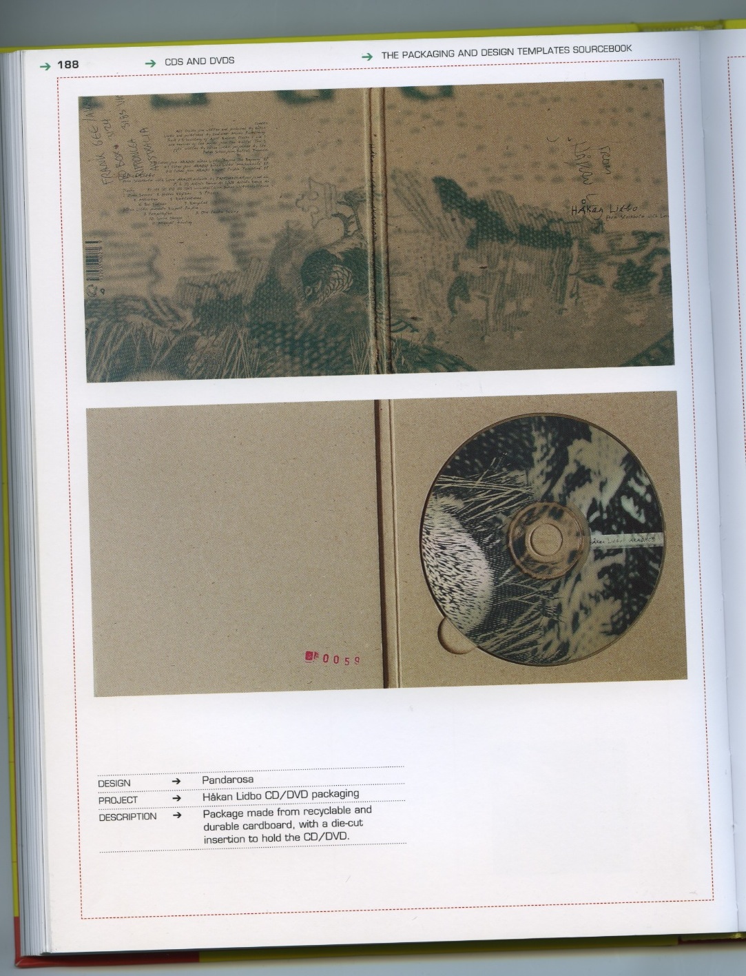
These are scans from the packaging and design templates sourcebook,published by rotovision. I have selected these 3 templates, because of their appearance ad what relevance that could have for me.
Because I am producing vinyl sleeves made from card, it would be fitting to keep the cd cases also made out of card to unify the range, but this is also economically friendly, for a record label this would be good because they may not have alot of money initially to worry about really high end materials for packaging, so card and similar stocks are really worth bearing in mind. Also the green image printed on the last case is of a similar colour to my colour scheme at the moment, and the green ink looks really good on the brown/ sandy coloured stock.
Tuesday, 11 May 2010
Drunk Punk
Drunk punk has done some amazing album and record sleeve design. "The Gift of Gab" looks really really good. Obviously has a space theme with referance to the ancient civilizations, but the imagery is really inspired, and well executed - I imagine producing images like this to a very high standard is not easy, but I am thinking about using imagery in my record/CD design and I do want to use a set colour scheme, like DP has used red and black as his main colours here, I want to use three greens and a black. I would love to get my hands on some green vinyl to really enhance my design, but I am having trouble sourcing a dark green vinyl record. With the Gift of gab design, it is easy to see how this design could be used across a website, on flyers and a range of promotional material like business cards. I wanted to post this up because its a really consistant design and the colour uniformity is working really well.
The future punk album is another photoshopped piece which is based on imagery that I think was recorded by the designer, comprised of engines, industrial material and landscapes. I think there is alot going on here in terms of how much type is on the cover, but I think it does work. He uses simple type that is uniform, but at different scales.
The Mike Monday album is very fun and colourful, with some amazing illustrative work on it, I would love to produce some illustrative work for this brief, but It doesnt fit with the design direction I have been going down, As I have been focusing on type and layout mostly throughout the design stages of my products.
Monday, 10 May 2010
What content goes on records/ Cds?
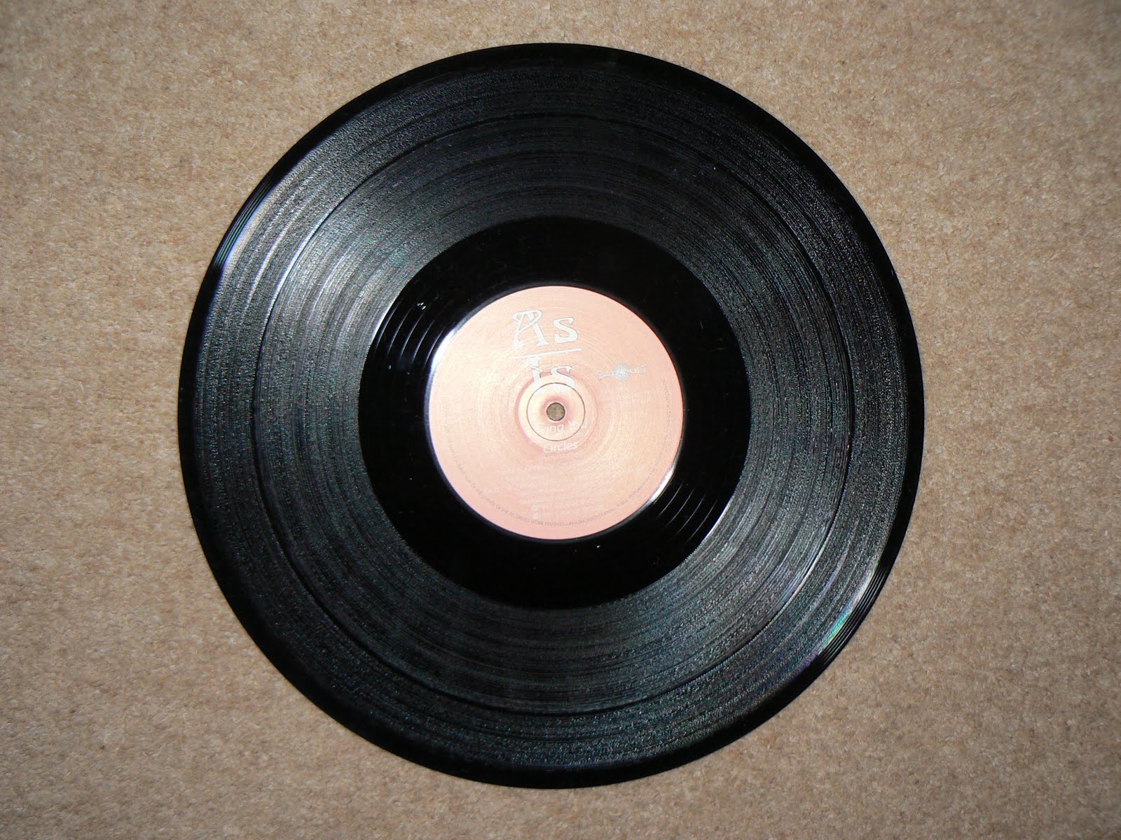
I picked some records up on the cheap to see what informational content was on their stickers. Generally There is the following information:
- Artist name
- Record label name
- Release number (e.g) CPULT001
- who it was distributed by
- Rotations per minute
- Producers of the track(s)
- A side/ B side information (track names on which side)
- Date of release
- " All rights of the manufacturer/ artist and of the owner of the recorded work reserved. Unauthorised copying, public performance and broadcasting of this record prohibited."
These same pieces of information apply to 7 Inch records (whose sticker is pretty much the same size.)
With CD's, this obviously differs, because the target market/ audience do not need to know how many rotations a disk does a minute, etc and often the disc will say on it; "see booklet for further information" Which does free up alot of space on the disc itsself.
This is Braintax's album: Panorama, in which there is a full bleed image, and the only information on the disc is;
- Artist name
- Album name
- Record label & date of release
- Contact details
- "All Damn rights reserved as per usual"
- Labels release number (LOW46CD)
12" & 7" Records.
- Artist name/ identity
- Record label
- Release date
- Release number (ALS01)
- Contact details
- Web adress
- A/B side information & RPM
- Copyright information
- Artist name
- Tracks on the disc (numbered)
- Copyright information
- Release number, for discs this would be (ALS01CD)
- "See inlay for more details" - these details would be - contact details, website adress track information in more depth - e.g producers, who mastered the track who mixed down the track the year, who wrote it etc.
Sunday, 9 May 2010
Memorable logos: Nike & Adidas
The Nike logo was designed by Carolyn Davidson who was a student graphic design student at the time of designing it. The Nike swoosh is very, very memorable and just about every human being on earth will probably recognise this logo on seeing it. The logo initially started off with the work Nike attached to it, but the company's success grew and the logo was adapted to reflect how successful the copany was becoming.
The logo changed to be presented on all products and promotion as just the tick, with the strapline, "just do it." This is because of how famous the tick itsself had become. It shows that a simple shape can be a really effective method of communication in terms of a companies identity. A shape as simple as this can be, and has been applyed to a range of thousands of Nike products, and is often amongst the defining features of a nike product.
Adidas is another very well known product, with a memorable logo which uses simple pictograms and type. Adidas has two very well known logos:
Thursday, 6 May 2010
Subscribe to:
Posts (Atom)