Monday, 10 May 2010

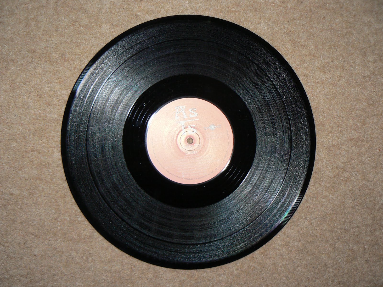
What content goes on records/ Cds?

I picked some records up on the cheap to see what informational content was on their stickers. Generally There is the following information:  
  • Artist name
  • Record label name
  • Release number (e.g) CPULT001
  • who it was distributed by
  • Rotations per minute
  • Producers of the track(s)
  • A side/ B side information (track names on which side)
  • Date of release
  • " All rights of the manufacturer/ artist and of the owner of the recorded work reserved. Unauthorised copying, public performance and broadcasting of this record prohibited."
The last phrase is normally wrapped around the circular form of the sticker itsself.
These same pieces of information apply to 7 Inch records (whose sticker is pretty much the same size.)


With CD's, this obviously differs, because the target market/ audience do not need to know how many rotations a disk does a minute, etc and often the disc will say on it; "see booklet for further information" Which does free up alot of space on the disc itsself.

This is Braintax's album: Panorama, in which there is a full bleed image, and the only information on the disc is;
  • Artist name
  • Album name
  • Record label & date of release
  • Contact details
  • "All Damn rights reserved as per usual"
  • Labels release number (LOW46CD)
 Doing that has given me a really clear idea of what i need to put on my products, and what i need to consider when designing them.

12" & 7" Records.
  • Artist name/ identity
  • Record label
  • Release date
  • Release number (ALS01)
  • Contact details
  • Web adress
  • A/B side information & RPM
  • Copyright information
CD
  •  Artist name
  • Tracks on the disc (numbered)
  • Copyright information
  • Release number, for discs this would be (ALS01CD)
  • "See inlay for more details" - these details would be  - contact details, website adress track information in more depth - e.g producers, who mastered the track who mixed down the track the year, who wrote it etc.
So, this is my content for my record stickers and CD design. Sorted. I will also do the same for the record sleeves, myspace, website and CD case/ Inlay.

Sunday, 9 May 2010

Memorable logos: Nike & Adidas

The Nike logo was designed by Carolyn Davidson who was a student graphic design student at the time of designing it. The Nike swoosh is very, very memorable and just about every human being on earth will probably recognise this logo on seeing it. The logo initially started off with the work Nike attached to it, but the company's success grew and the logo was adapted to reflect how successful the copany was becoming.


The logo changed to be presented on all products and promotion as just the tick, with the strapline, "just do it." This is because of how famous the tick itsself had become. It shows that a simple shape can be a really effective method of communication in terms of a companies identity. A shape as simple as this can be, and has been applyed to a range of thousands of Nike products, and is often amongst the defining features of a nike product.


Adidas is another very well known product, with a memorable logo which uses simple pictograms and type. Adidas has two very well known logos:


The Nike and Adidas logos both work as type, type & Image, and just image. It is this effectiveness I want to replicate in my logo design. I think doing this will make my logo design more so applicable across a range of products and promotional material than an over complicated and decorative logo.

Thursday, 29 April 2010

How identity relates to a product - Headhunter's album: Nomad


The identity is the design, It makes the product look and feel complete. In this case it makes the product more desirable as well as promoting the album name and the artist. There are some things in place here that make this identity work really well. Some of these are: The album name is nomad, (this is because all the tracks were made in different places across the UK.) The designer has played on this by using different coloured shapes to represent different areas of the uk, then placing these against the track names on the back of the CD, but then also placing them under the CD tray inside the case, as an information graphic showing this information.  The type of the album name is an identity in ittsself, with the rest of the type following suit in the same visual approach. The design for the  cd is also considered within the design uniformity, with the type curling round the circular form of the cd.

The way this product relates to a range is that Headhunter has this album out as a CD, a digital album (on iTunes) and as vinyls, which come in three different colours. A talk with Fred made me realise how Vinyl is often now more of a collectors item than a real functional product in the modern age, Collectors are part of my target audience, and this should be considered in the product design stages. This record in particular uses specialist bespoke finishing techniques such as die - cutting, and custom coloured records, which havve on them the same typeface as the CD.

Give up art

Logo and identity specialist, (especially in the field of urban music) Here are a few of my favourite logos he has designed. This slick simplicity is really inspiring me because I think having a logo like this would really make the identity of the label alot stronger than an overly complicated logo.

Existing record label - Tempa


Really nice identity, simple, but effective - designed by Give Up Art, this designer designed most of the branded identities for the producers and musicians involved with dubstep music (of which tempa is).

Clean and legible with a stripped back urban feeling colour scheme. This is the direction I need to be taking my logo and identity design in.

What is a branded identity?


A branded identity is often what makes a product unique, and in terms of music and the music industry is an enhancement to an artist or a means of recognition for a label. This also applies for every design company, their identity makes them, visually at least, who they are in the public eye. This is the branded identity for Universal everything, shown on a product along with business cards. Very simple identity, but very effective because of the process used afterwards to enhance to the type.

" marked or labeled by a distinctive word or symbol indicating exclusive rights" - wikipedia quote